


1.Smudgers
2.Riesling
3.Heretica
4.EightOne
5.CFB


"Q" is a music magazine. Their original target audience are people from the male demographic whose ages range between 24-44. Although it is a male magazine, like other magazines of course others from the opposite will also read it. Q magazine is a magazine that is not soft, but quite hard so features more hard rock artists such as Madonna and Muse magazine has a lot of in-depth articles due to their target audience, they will not feature artists like Hannah Montana and Jonas Brothers due to the demographic being quite older. The word “Q” sounds like homonyms. Q sounds like queue which could refer to the fact that many different artists are queuing up to be featured in their magazine. Q also sounds like cue which is a musical term, telling the artist that it’s their time to begin, possibly highlighting that this magazine boosts many different artists’ careers. The colour this logo has are red and white, red to possibly highlight the passion off the magazine, as well as possibly danger, while the white highlights the simplicity and calmness of the magazine. People from the English readership will recognize these colours as colours for the national flag. The style of this letter is very formal, and looks like a classic Times New Roman font. This magazine is published monthly.
NME is a music magazine which is an acronym for 'New Musical Express'. The acronym is done so that the name of the magazine is easier to remember. Most times the audience do not know what the acronym stands for. The original target audience are people from the male demographic whose ages range between 15-24, so mainly teenagers. They use the colour red to show their passion and love for music, whilst they use capital letters to make a bold statement that they are a powerful company. They use a selection of three colours to make the magazine stand out so that many connotations can be gathered from it, such as they cater for different ages. The word NME said fast and casually sounds as if your saying "enemy", possibly as if the magazine are an enemy to normal society, so they co in the complete opposite of what stereotypes say. The use of the black background makes the text stand out more, its almost as if the text is three dimensional. The font seems to be Arial.

Kerrang is a music magazine which is suited for the rock genre. The original target audience are people from the male demographic aged 15-24, but the main readership of this magazine is actually 15-44. The title is actually very bold and consists of visible cracks to show that the magazine is hardcore, and a powerful magazine to an extent it even cracks words. The word kerrang sounds like an instrument struck violently, and the text kerrang shows this. The cracks show deformation and violence, it is only in black which shows that it believes in one statement and it does not believe in any others. It only uses one colour which shows that they only cater to one genre audience and that is the rock audience. The black text fits in to the stereotype that the only people that read these magazines are emo's, Goths and scene people.

Vibe is a music magazine. Their original target audience are people from the female demographic aged between 15-24. The title is very standard yet bold and in your face. It is written in red font which stands out to show passion and independence of the magazine, carrying the R&B genre. Vibe varies the colours it chooses for each issue, although the red in this issue could possibly highlight the passion and emotion of the person covering the front cover. The font seems to be a bold and large sans serif font. It seems to use a mixture of capital and lowercase letters within the title. The title looks very professional, but the V is slanted which seems to give the title as well as the magazine an edgier feel to it.
The source is a music magazine. This magazine title block seems to be more tedious and less appealing, even though it uses a bright colour such as yellow; the black background deflects the spirit of the title. The font seems to be sans serif. The word "The" is at the side of the word "Source" in a smaller font to highlight the importance that this magazine is not just any magazine but it is a huge source of information.
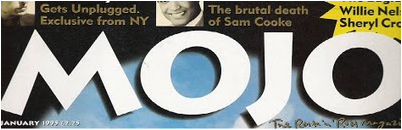
Mojo is a music magazine. The original intended target audience are males. The word originally means a charm or a spell. But now its more commonly said meaning sex appeal or talent, an example would be "I can get any girl if I just use a bit of the old mojo". The font is written in plain text to highlight its plain simplicity, whilst it has shadows to highlight that there is more than meets the eye than just the front cover, inviting the audience to read more. It uses two colours which are black and white which suggest that it is a rock magazine, due to it being the traditional colours of the genre. The font seems to be sans serif and bold, which highlights that it is not too much of a sophisticated magazine but a laid back one.

Mixmag is a music magazine. It seems to create its title from the use of two words mix and magazine, this is probably foretelling that the magazine is a different magazine and will consist of various different types of music and tastes. The title block uses bright colours, which is different from the previous magazines title blocks that I have analysed, this is probably done to highlight the genre of the magazine which may be pop. The font seems to be sans serif due to it not having any flickers on the end, this is probably done to show the flexibility of the magazine which is a dance magazine.
My ideal reader is named Levi Cruz; he is based in London and is 18 years old. Levi currently attends a Sixth form college, and is in his second year completing his A2 courses. In his spare time he enjoys singing, watching x-factor and is a DJ at his local radio station. He comes from East London which is an area which boasts of a variety of music tastes ranging from R&B to rock. His mother is a social care worker, whilst his father is a graphic designer. He is the eldest of his siblings, as he has two brothers and two sisters, which pits himself as well as his family in the c2 socio economic scale. My magazine is going to contain a lot of detailed articles, this is suitable for Levi because during his GCSE's he acquired A for English literature and B for English language, his target grades for his A2 all reside within the A*-C boundary. Levi enjoys playing basketball as well as partying. He also helps out with charity, but also enjoys doing graffiti. When Levi advances in his education he would like to go university, possibly a film school and major in film school and become a scriptwriter and director. On my front cover I will choose a stylish black male on my front cover, to appeal to people like Levi. Levi will like it because he can relate with the people


